
From discovery to delivery, establishing a scalable design foundation across platforms

Stakeholder meetings
Documentation review
User feedback analysis
Product requirements alignment
UX audit
Benchmarking industry standards
Identified inconsistency across flows
Weak visual hierarchy
Limited device support
Absence of structured design foundation
No centralised design reference
Initial design system framework
Core screen renders in Figma
Interactive prototype
User validation and iteration
Full design system with guidelines
Tokenised styles and scalable components
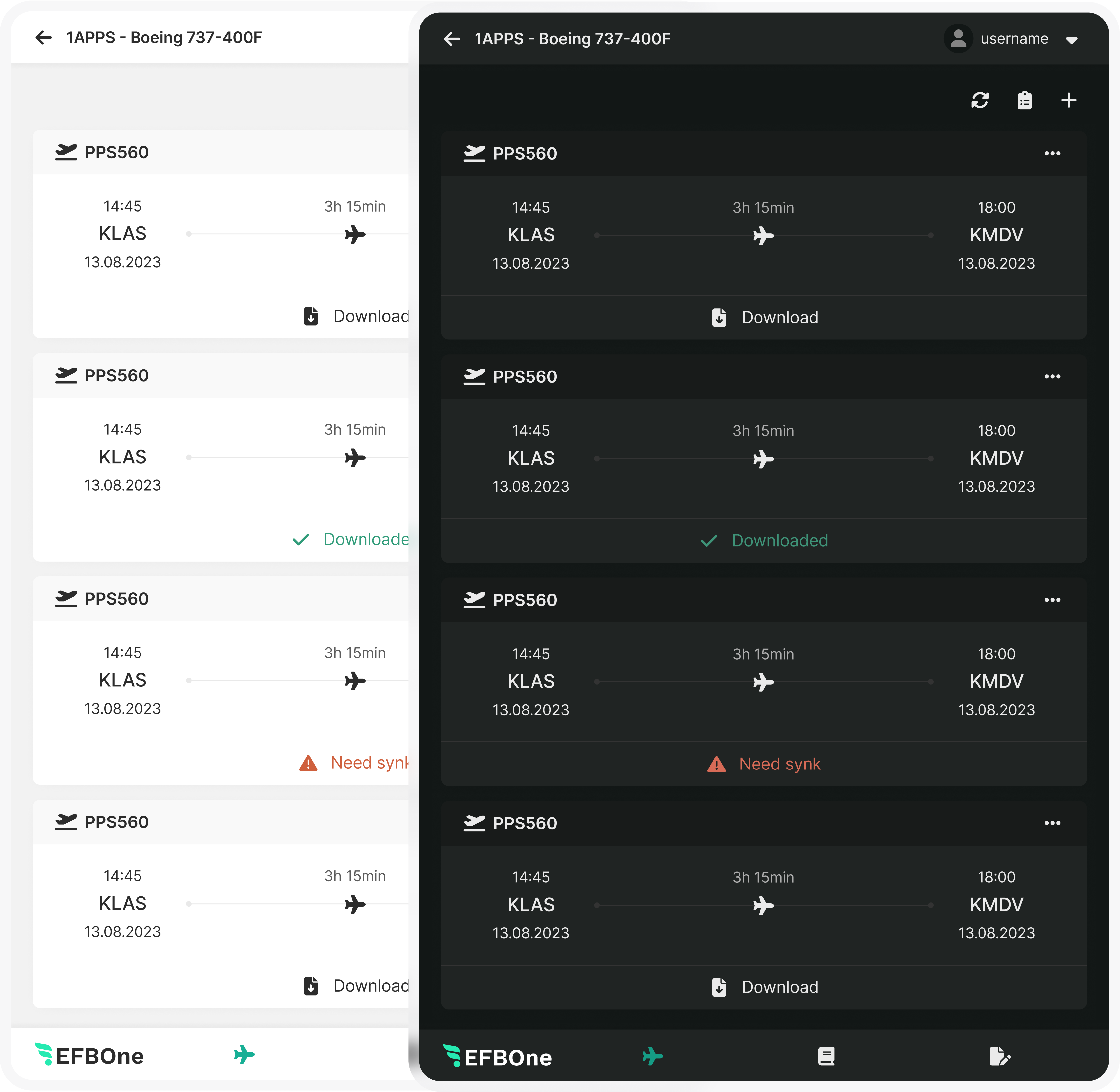
Cross-device adaptations (mobile & tablet)
Final usability validation
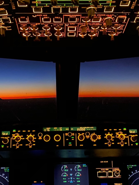
A safety-critical user operating in high-pressure, low-light environments where clarity and reliability are non-negotiable

43, Commercial Airline Captain
Operates commercial flights with responsibility for navigation, compliance, and safety coordination. Requires tools that surface accurate, time-sensitive data with minimal cognitive overhead.
Replace fragmented paper-based materials with a reliable digital workflow
Access critical information quickly without navigating unnecessary layers
Maintain operational precision in both daylight and cabin night conditions
Reduce manual overhead and administrative friction


Poor contrast in low-light environments
Inconsistent interaction patterns across screens
Small touch targets in turbulence or limited visibility
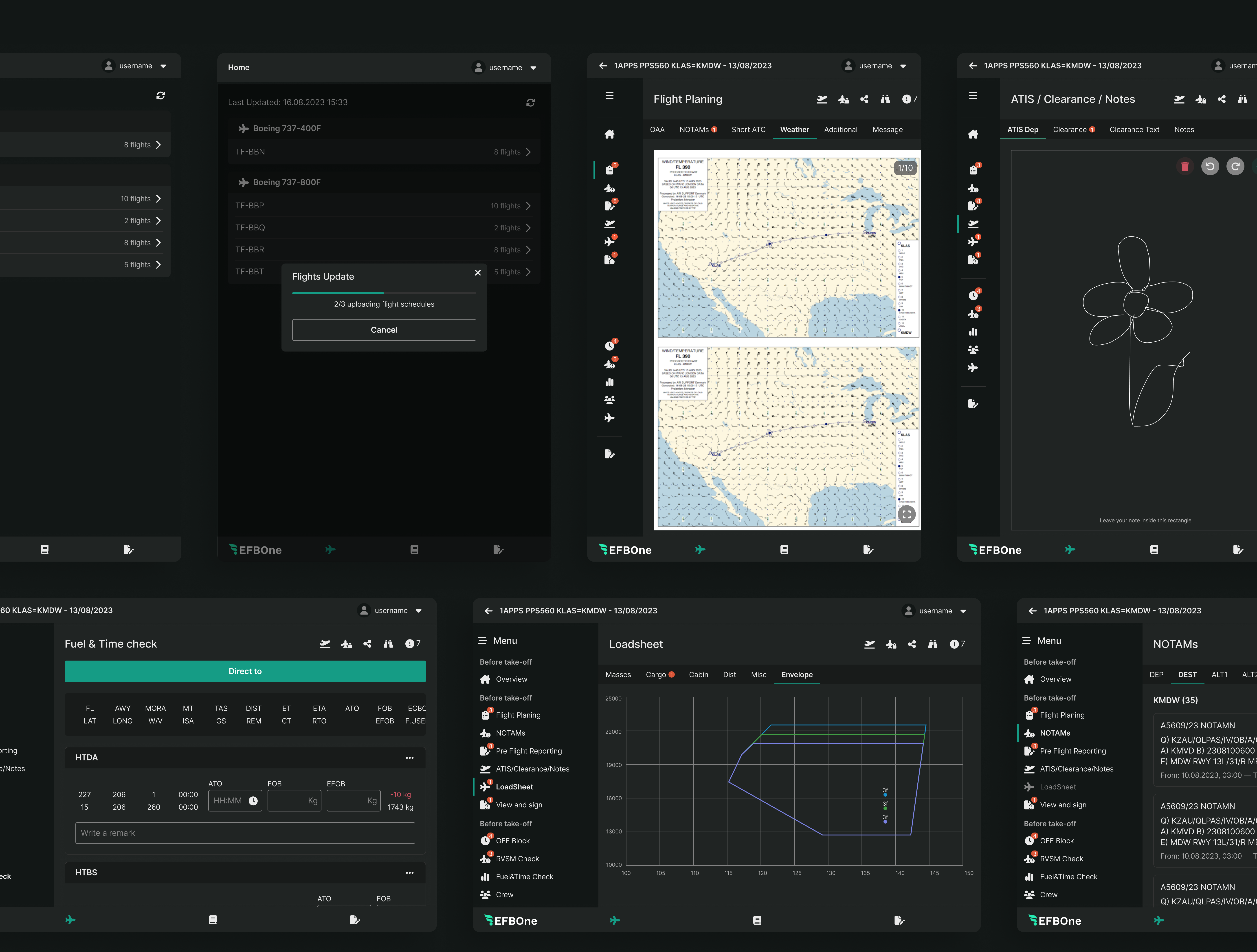
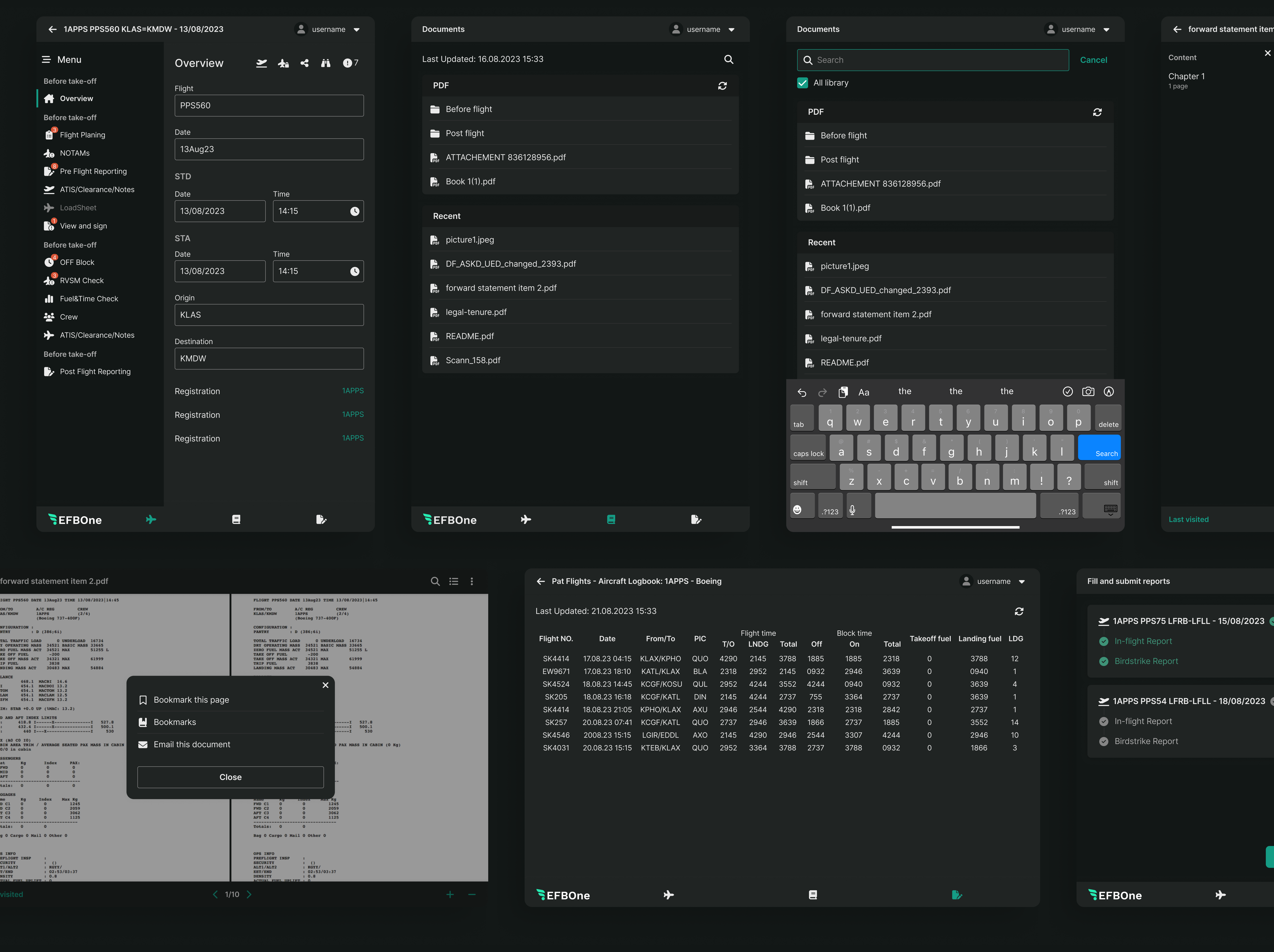
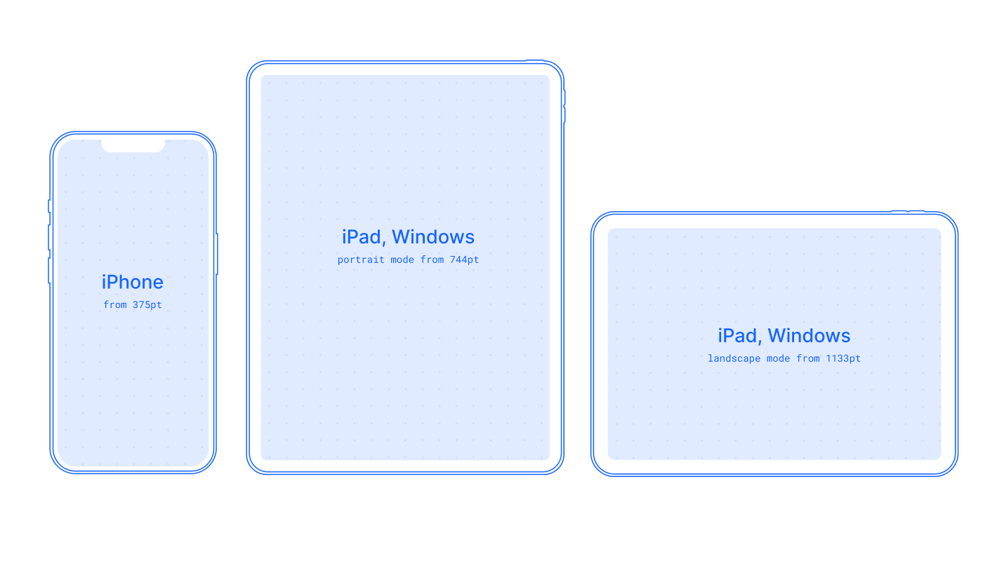
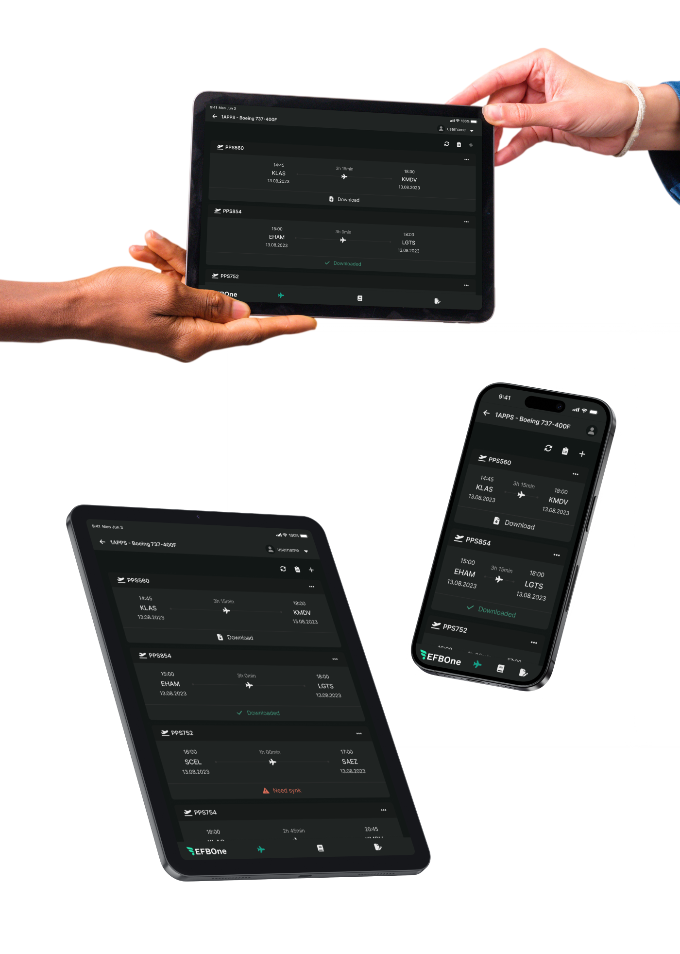
Designed for consistent cross-platform performance across iPhone, iPad (portrait and landscape), and Windows tablets.
Tablet portrait mode was prioritized based on usage patterns, ensuring the most common workflow received primary design attention.
The product initially lacked a cohesive design foundation. I conducted a structured audit to identify inconsistencies across layout, spacing, typography, interaction patterns, and system states.

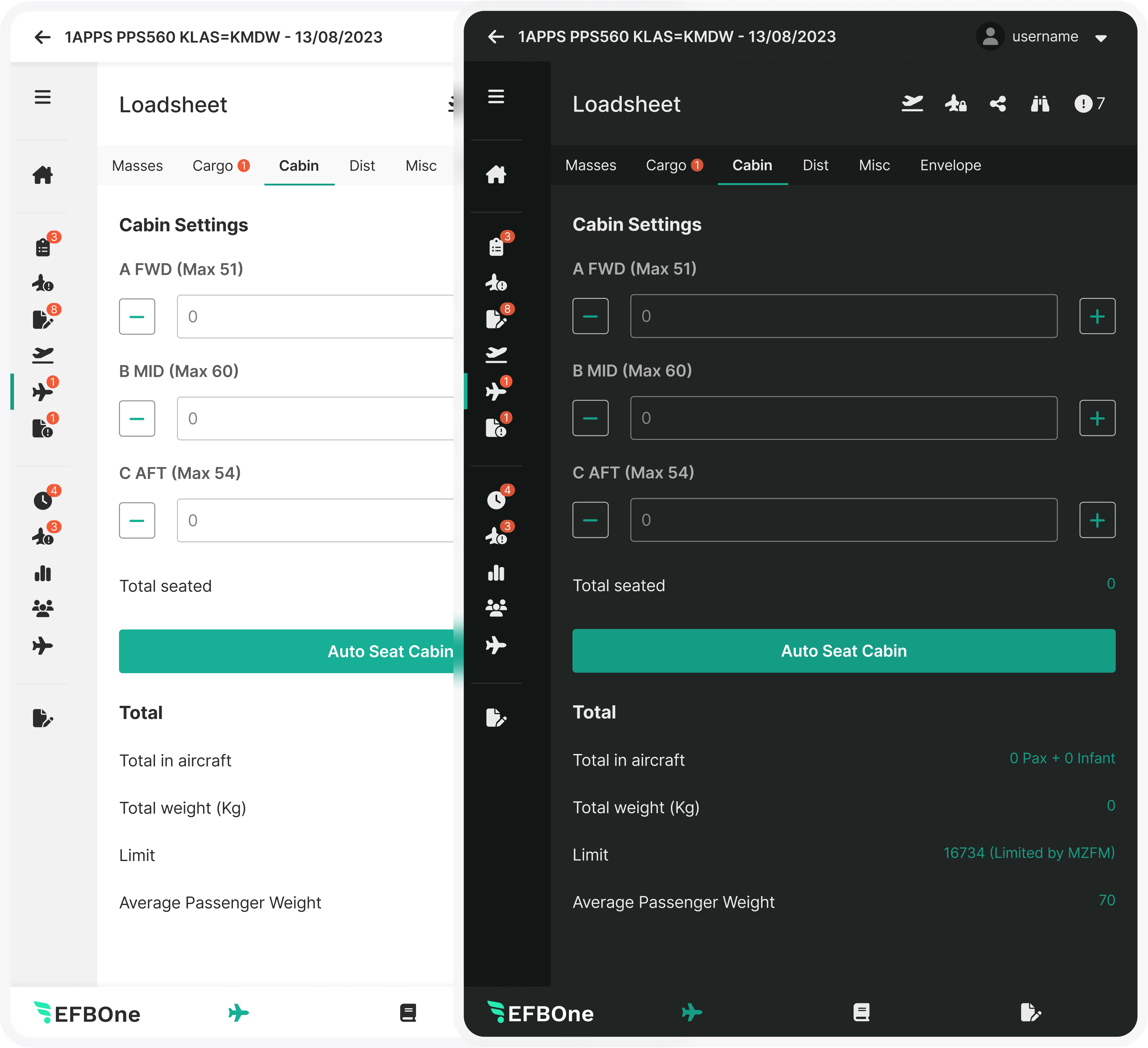
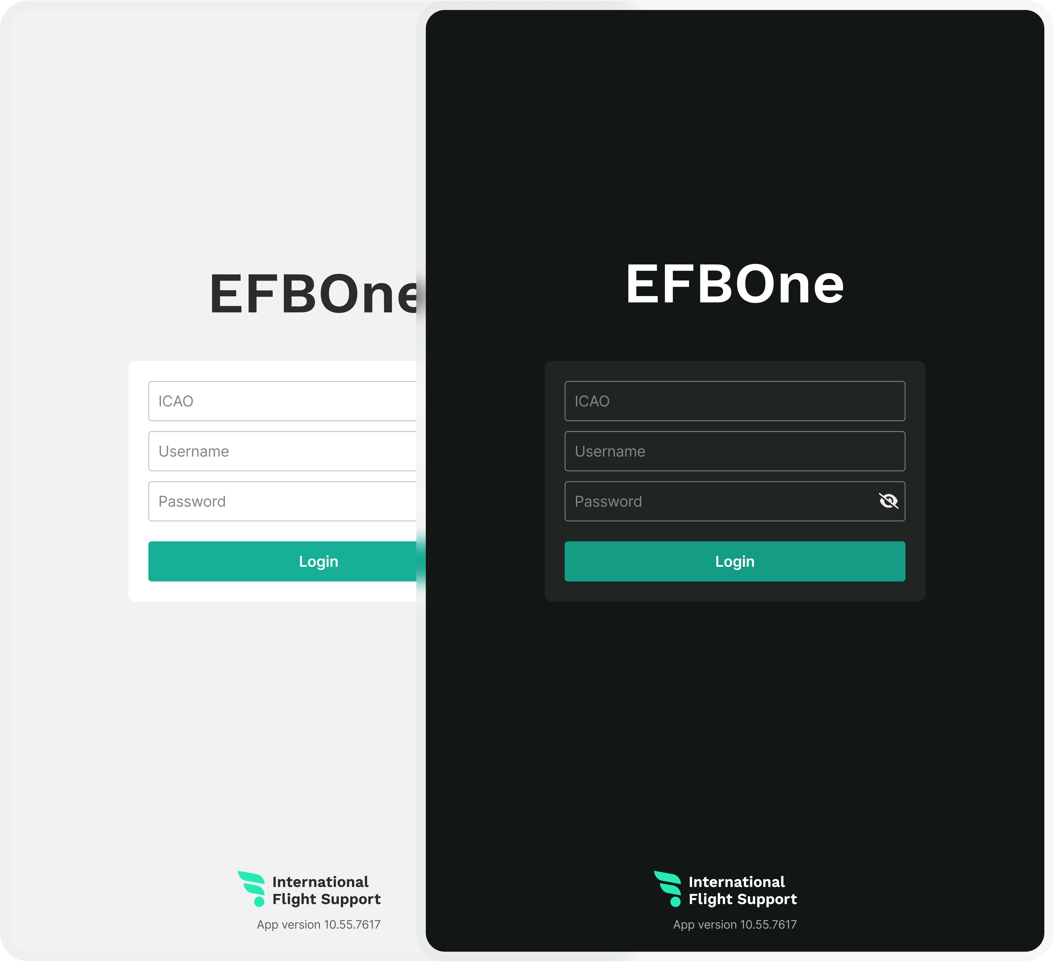
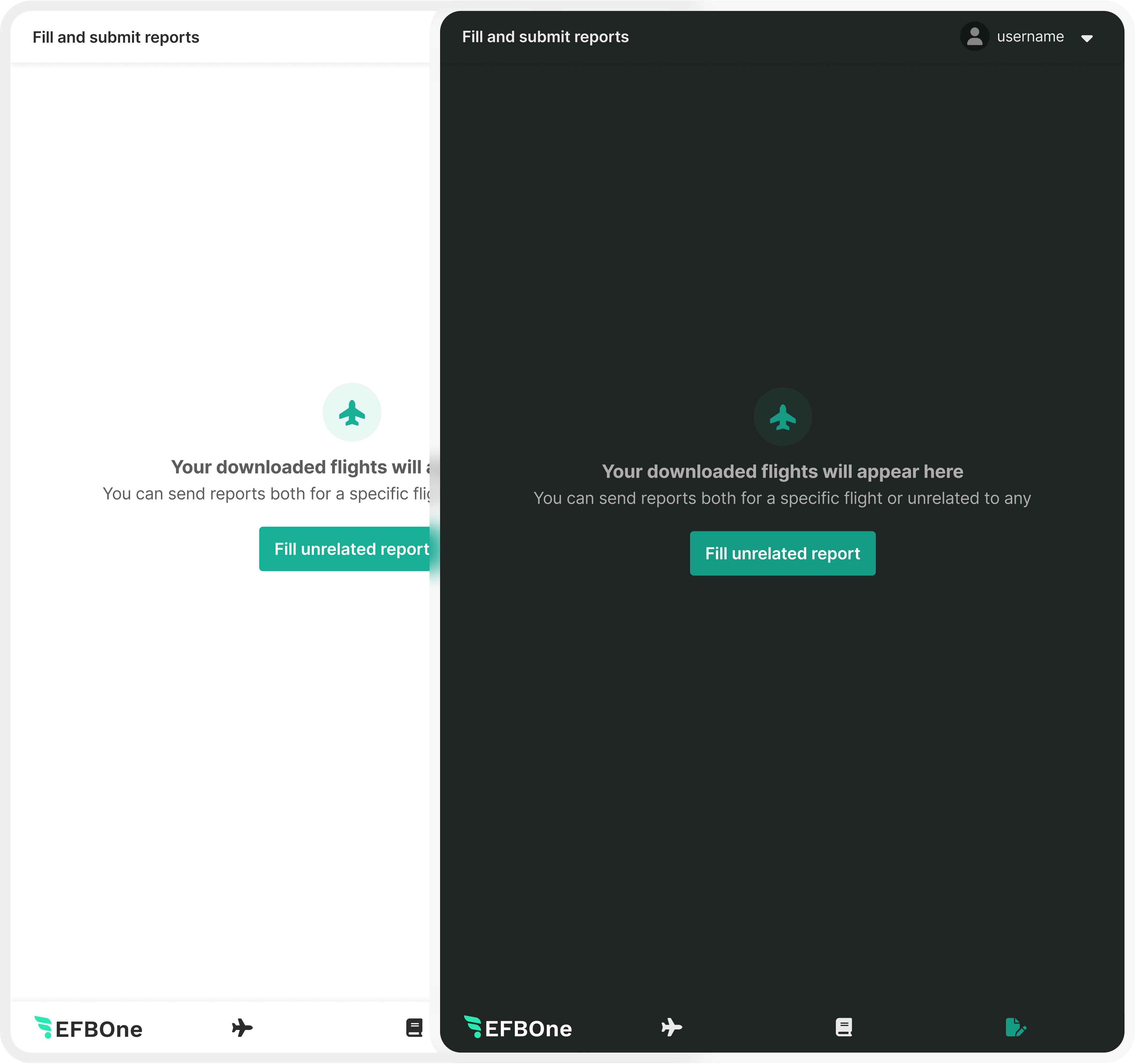
The system is built on constraint. A limited visual language, deliberate repetition, and controlled variation reduce cognitive load and prevent fragmentation. Consistency is treated as structural discipline, not aesthetic preference.

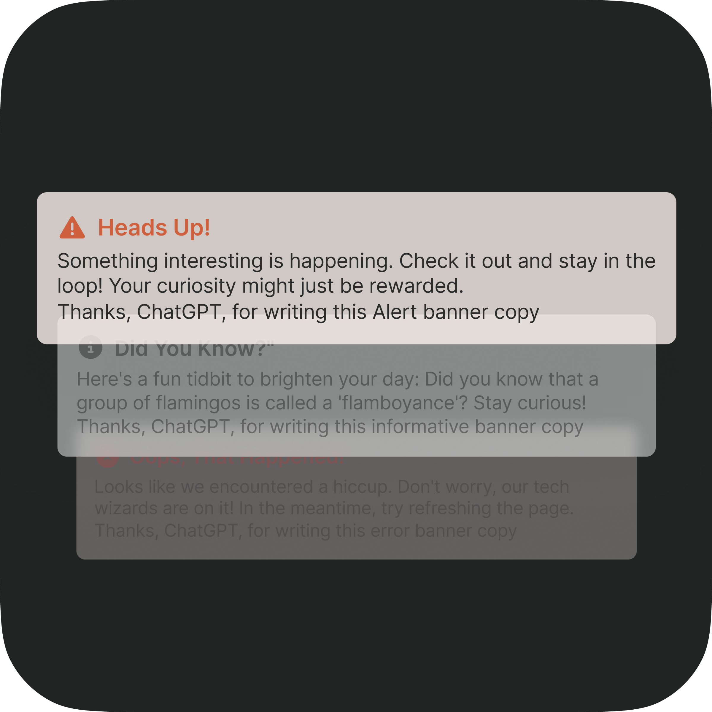
Every state is explicit. Loading, success, failure, and transition states are surfaced clearly to eliminate ambiguity. The interface reflects system behavior in real time, reinforcing trust through transparency.

Touch targets, typography, and layout scales are defined to remain legible and usable across contexts. Responsiveness is not adaptation for its own sake, but preservation of hierarchy and intent across devices.
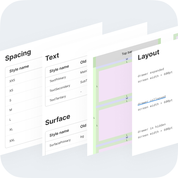
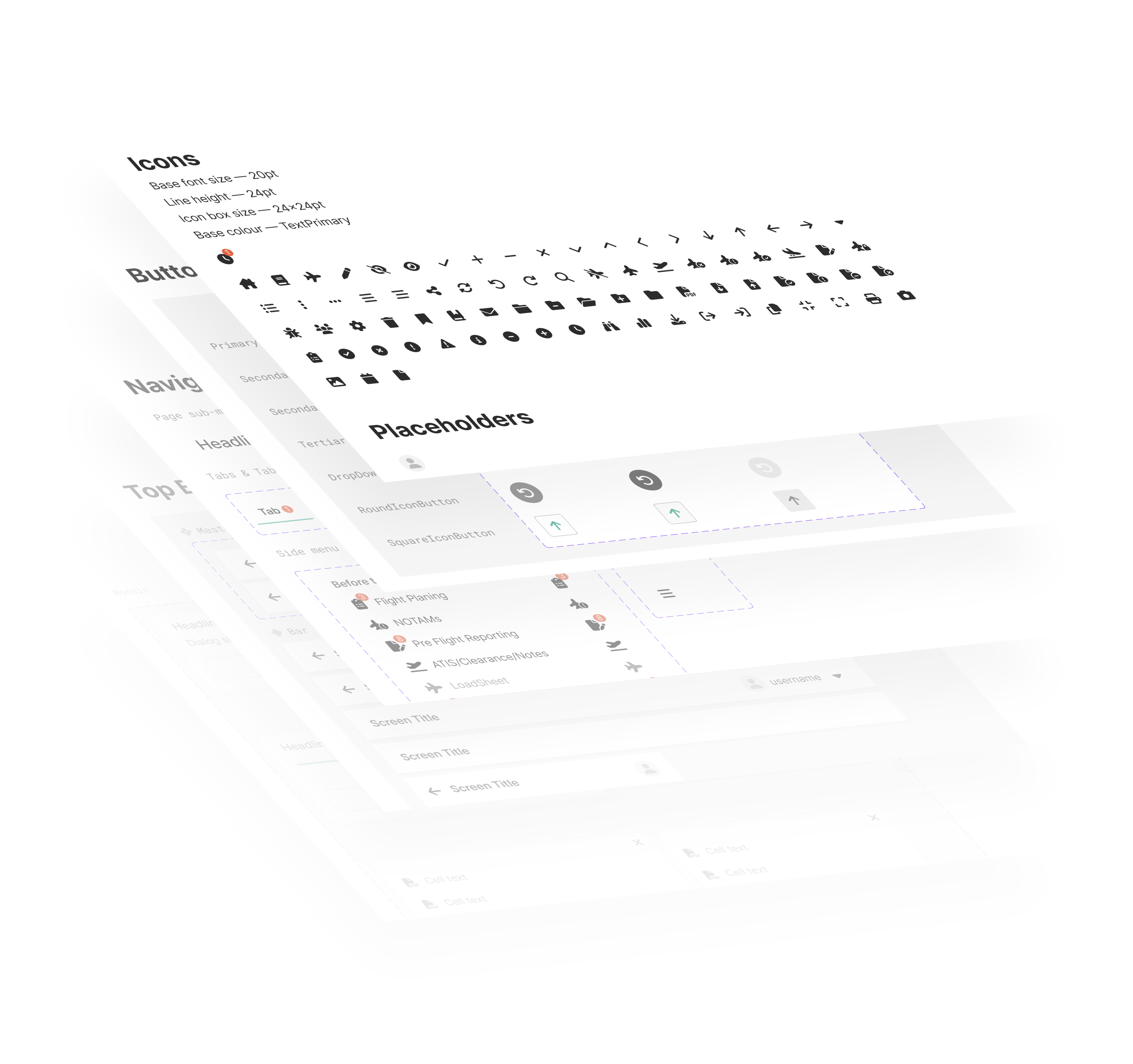
Color, typography, and spacing are defined as system tokens rather than isolated styles.Each value exists within a structured scale, enabling predictable composition and consistent implementation across platforms.
Components derive from shared primitives, ensuring coherence and reducing divergence over time.

A variable font family carefully crafted & designed for computer screens. Inter features a tall x-height to aid in readability of mixed-case and lower-case text. Perfect for cross platform projects.
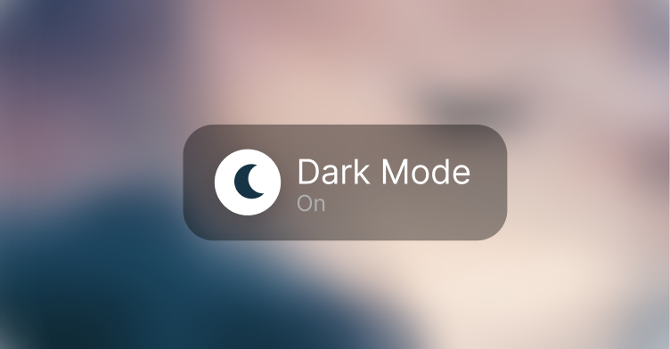
Light and dark modes are treated as parallel systems built on shared semantic tokens, preserving hierarchy and contrast across contexts.
Dark mode supports real cockpit conditions, where low-light environments demand reduced glare and sustained readability.


Core workflows and edge states are rendered and maintained in Figma as a living reference. This enables: shared visibility across design and engineering, faster validation of changes, clear traceability of interaction decisions.
The design file functions as a system artifact.