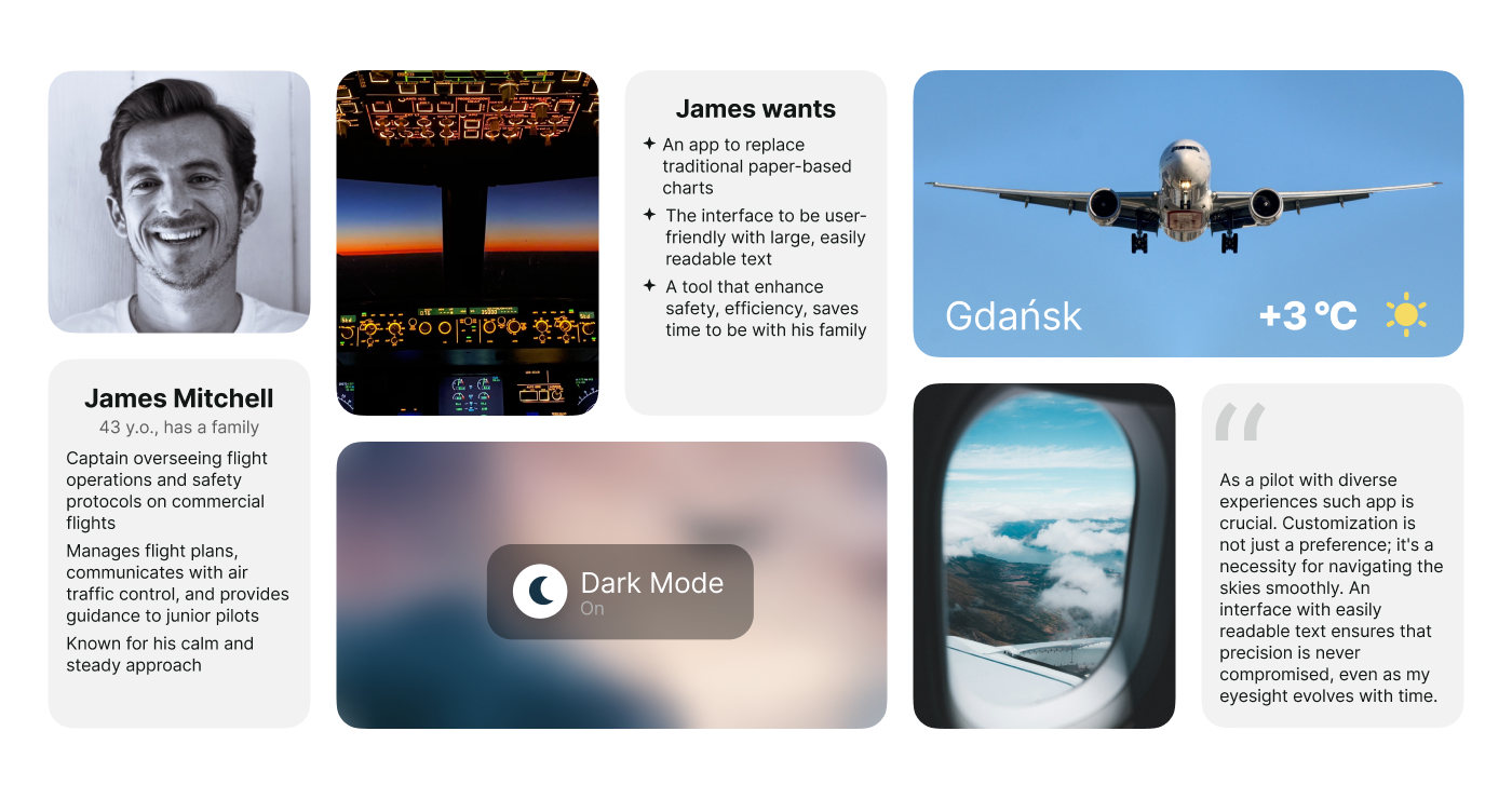
The most flexible Electronic Flight Bag in the industry designed to fit your flight ops One-to-One. A seamless all-in-one hub connecting all essential pilot apps for a streamlined, efficient, and safe flight operation.
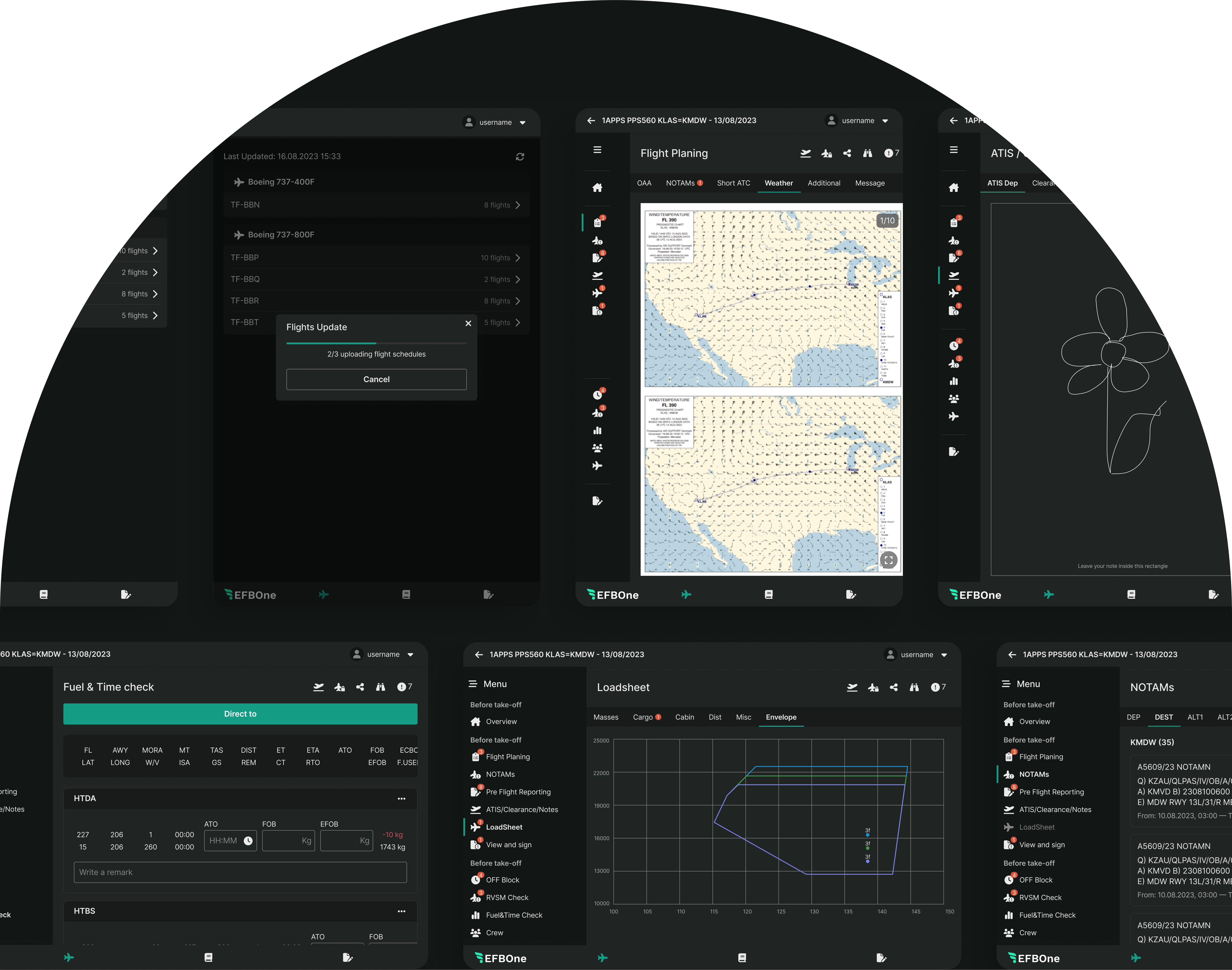
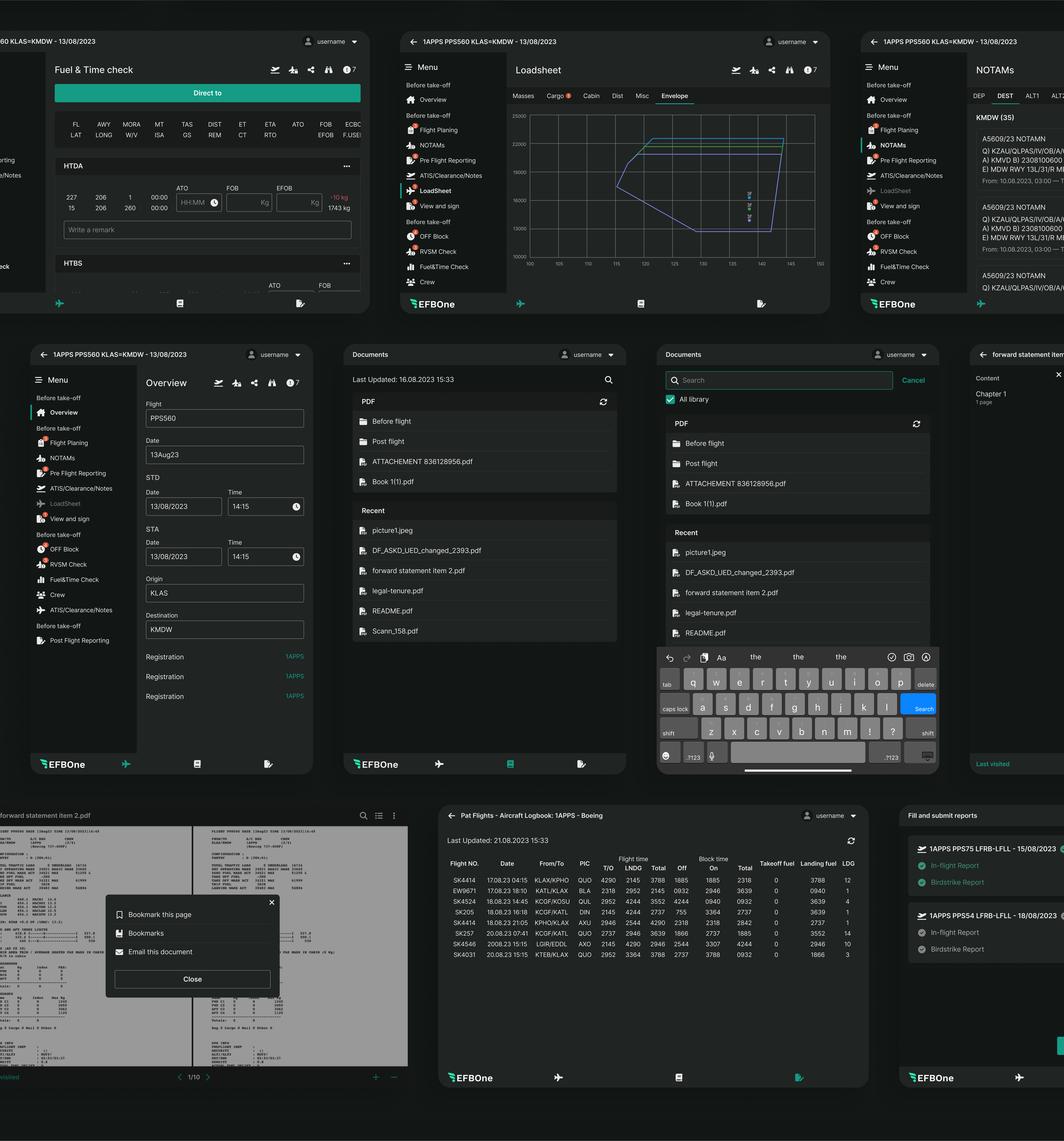
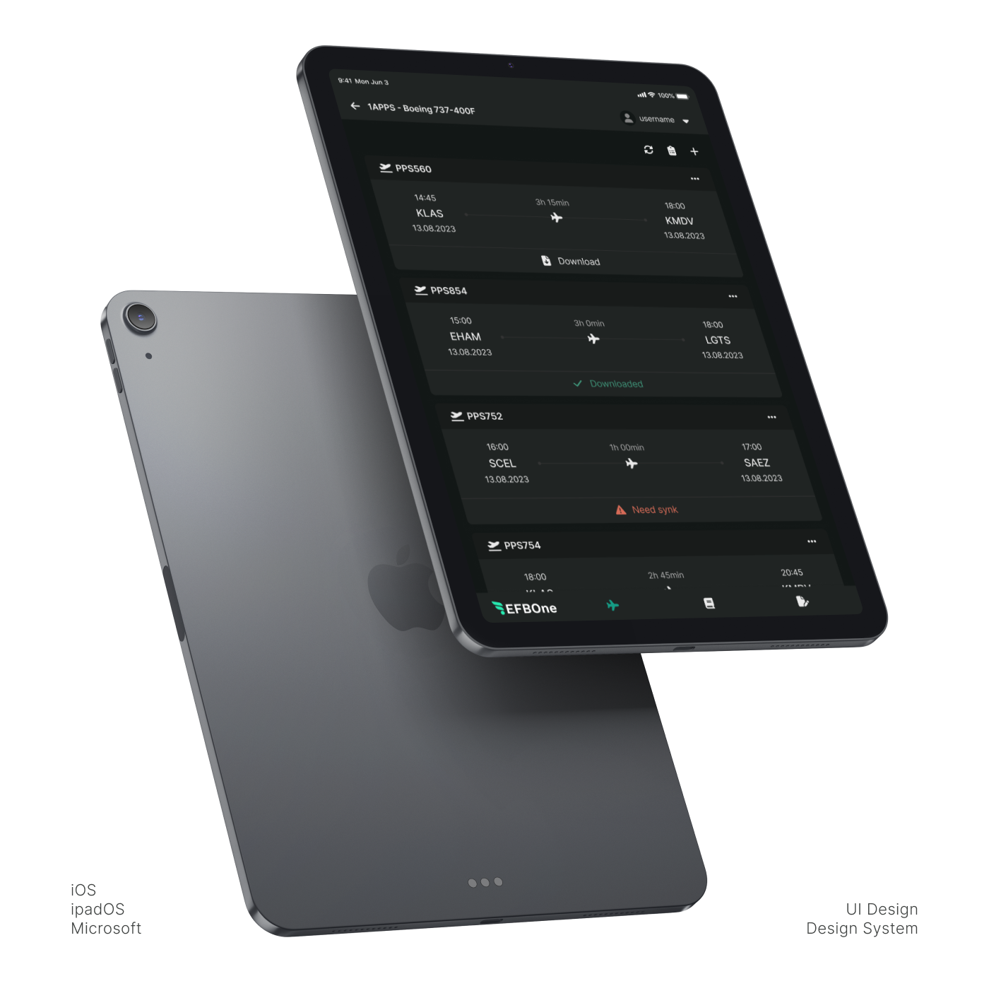
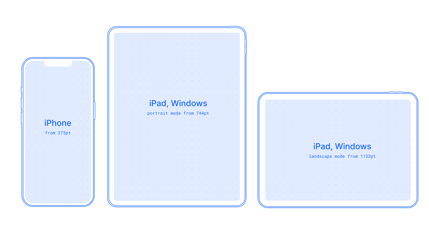
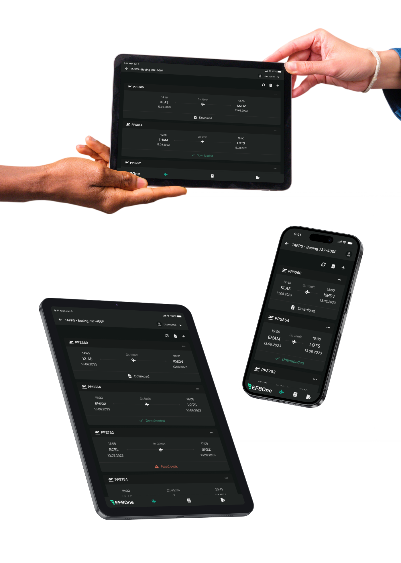
The app boasts cross-platform compatibility, catering to a range of devices. This includes full support for iPad in both portrait and landscape modes, accommodating various iPhone sizes, and extending compatibility to Windows tablets. Notably, tablet portrait mode takes precedence, aligning with its popularity among users
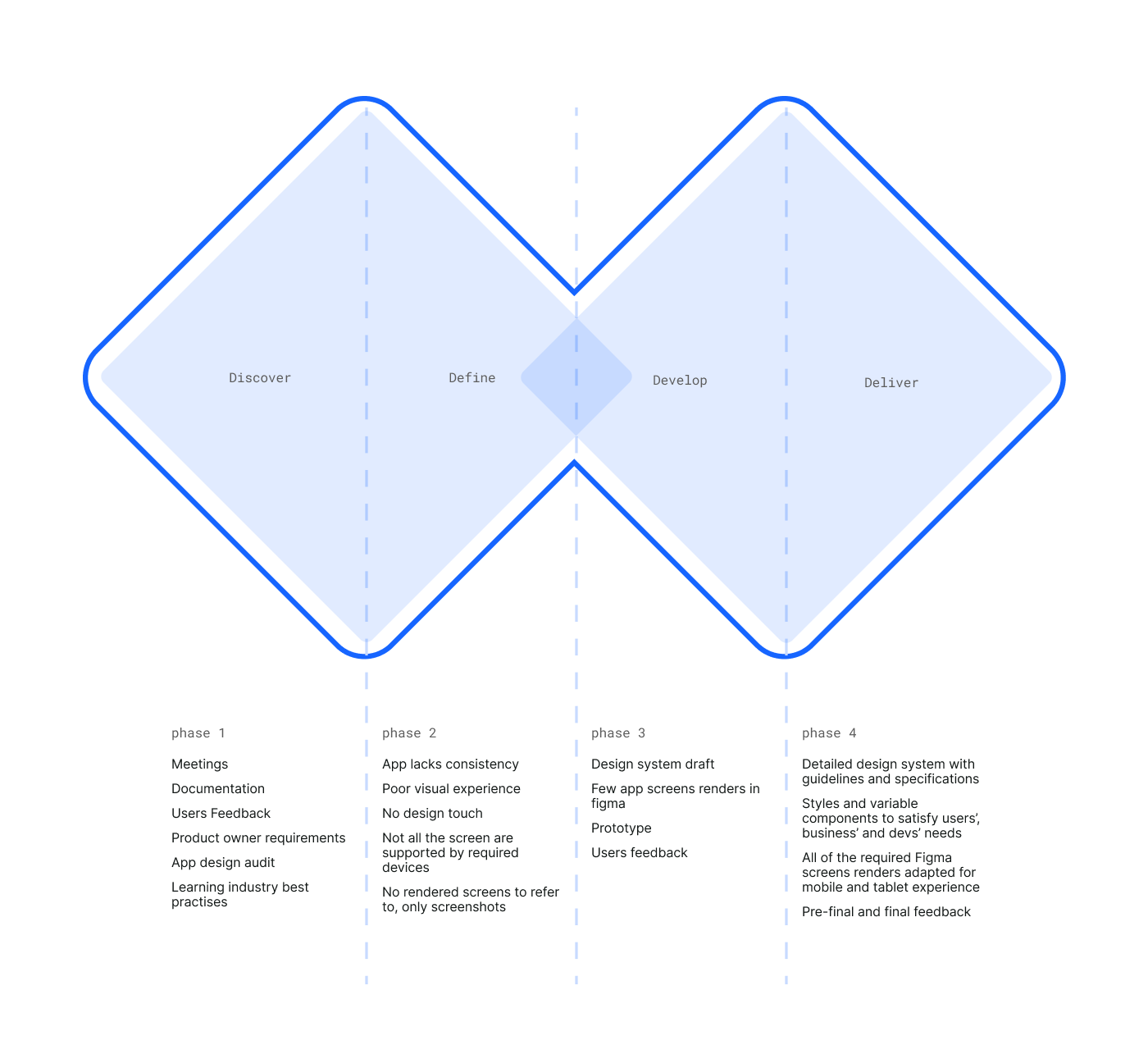
The app was created solely by developers and the product owner without design expertise. My role involved reviewing the app, identifying issues, and promptly responding.This led to the creation of a design system, where my emphasis lay in ensuring consistency, simplicity, addressing system status, and resolving touch area and sizing intricacies.
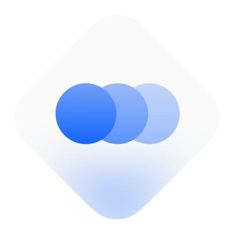
Maintain a uniform look by applying consistent styles across the entire app, promoting cohesion through intentional repetition and reusage. Prioritise simplicity by minimizing the use of colors and styles in both the design system and interfaces

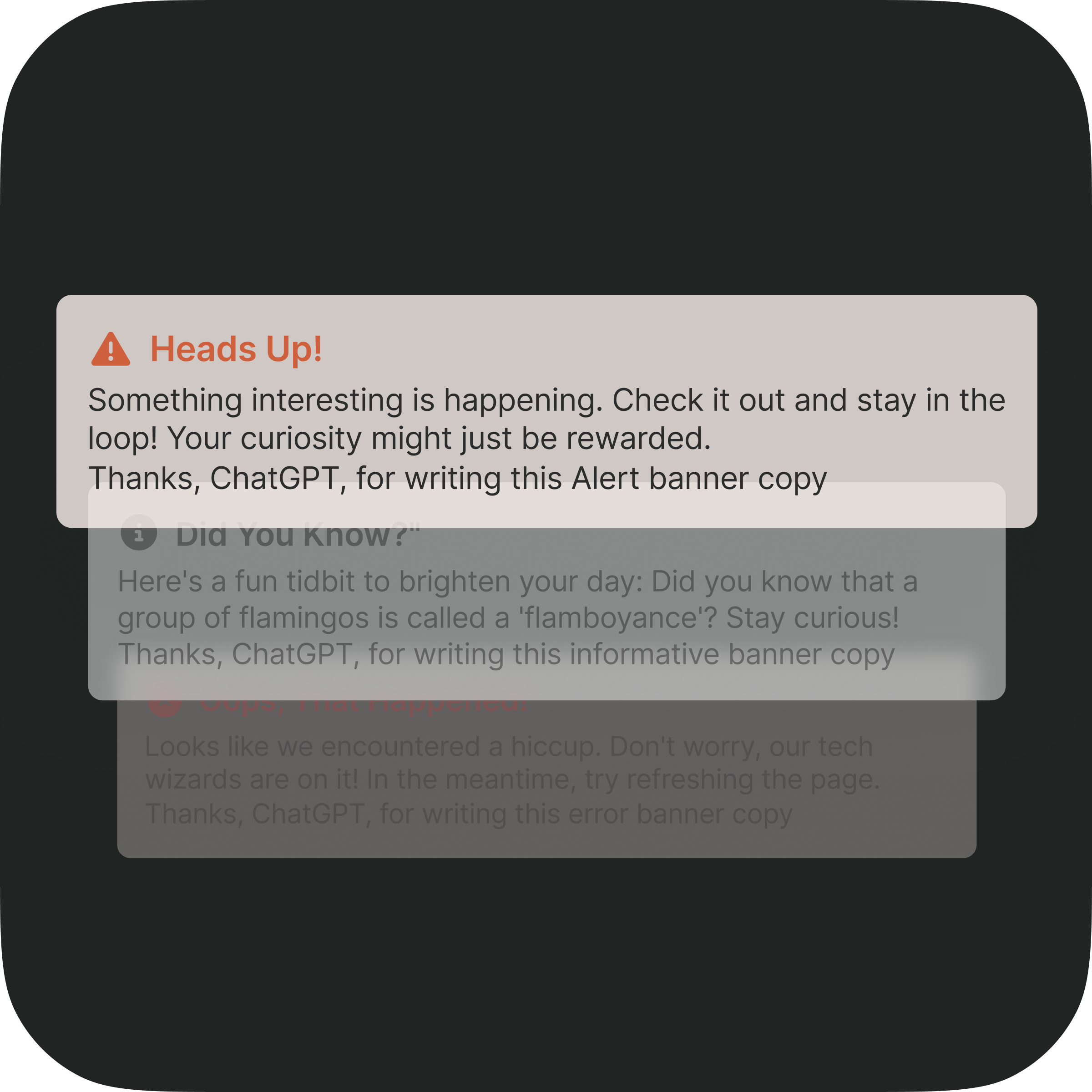
Always ensure users stay in the loop about app activities by incorporating elements like banners, spinners, skeletons, loaders, errors, and notification badges
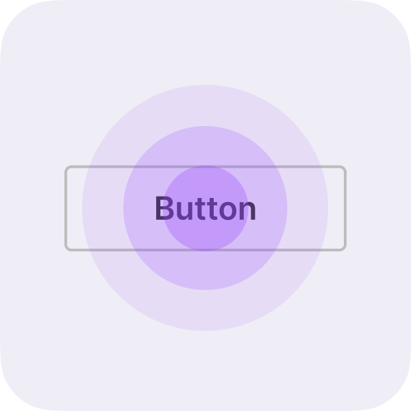
Always keep the touch targets comfortably large for easy tapping. Simultaneously, prioritise legibility, ensuring that text remains easily readable
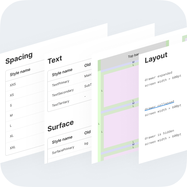
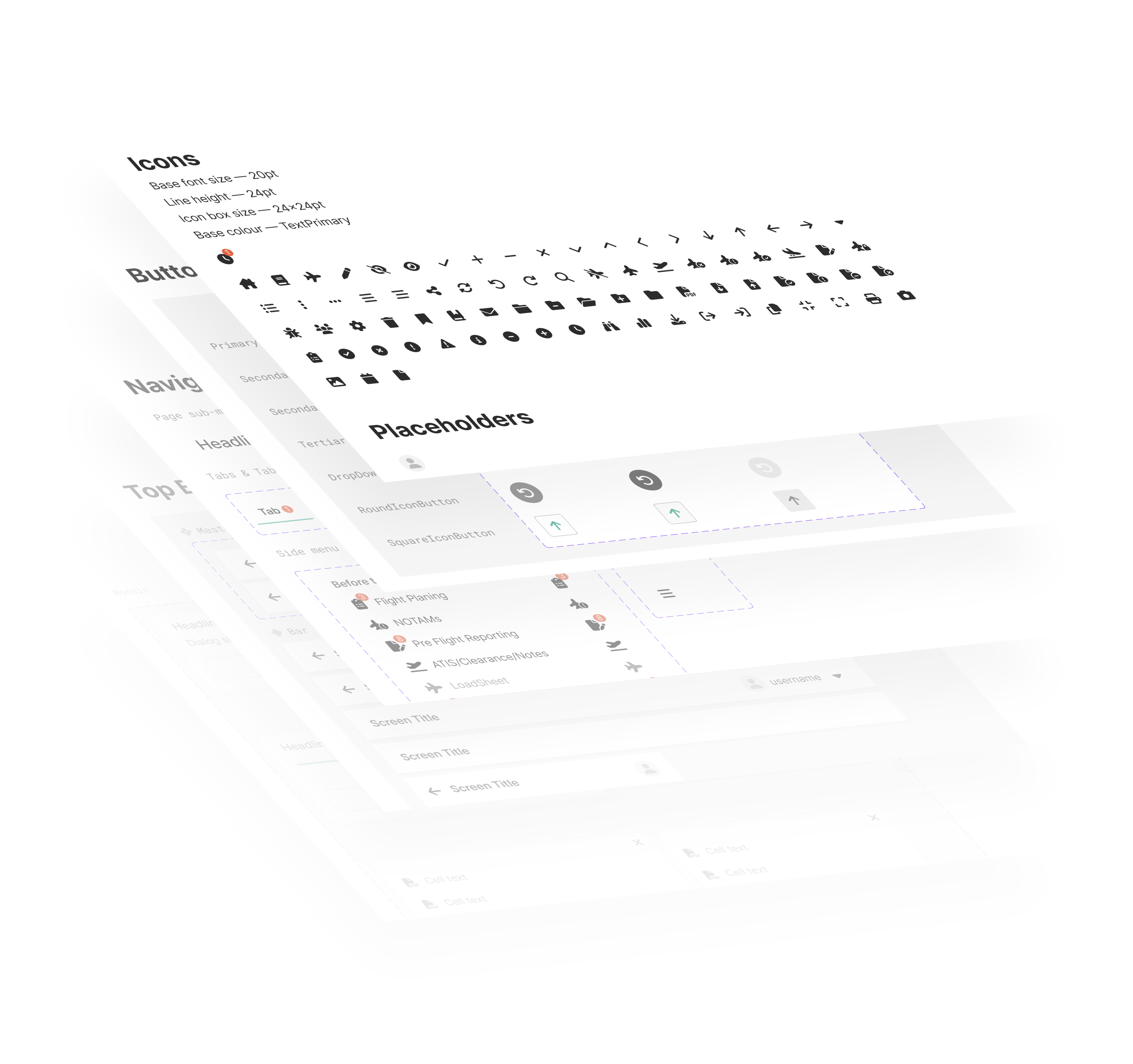
The team now has established color schemes, typography guidelines, and consistent spacing styles. We've crafted a cohesive design language. Variable components for buttons, inputs, controls, navigation, and modals contribute to a unified aesthetic and streamlined the development process
A variable font family carefully crafted & designed for computer screens.Inter features a tall x-height to aid in readability of mixed-case and lower-case text. Perfect for cross platform projects.
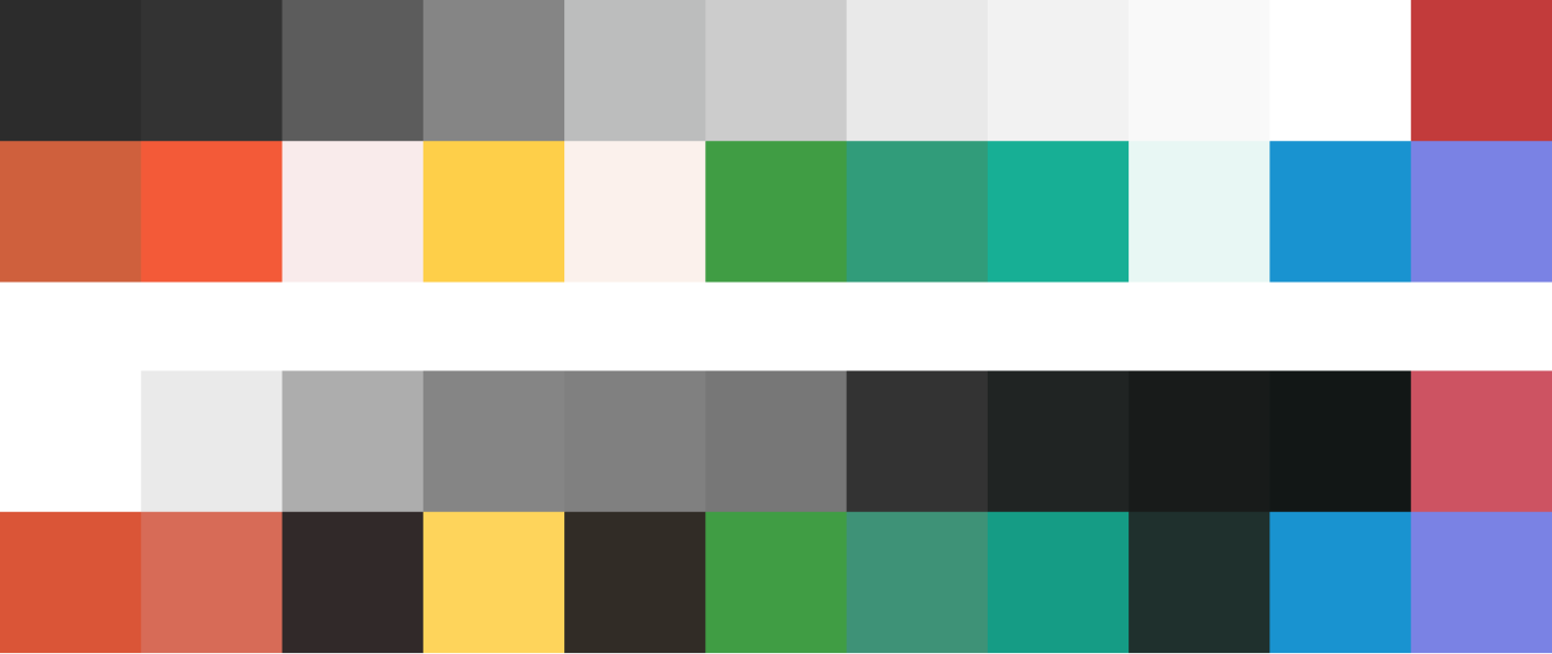
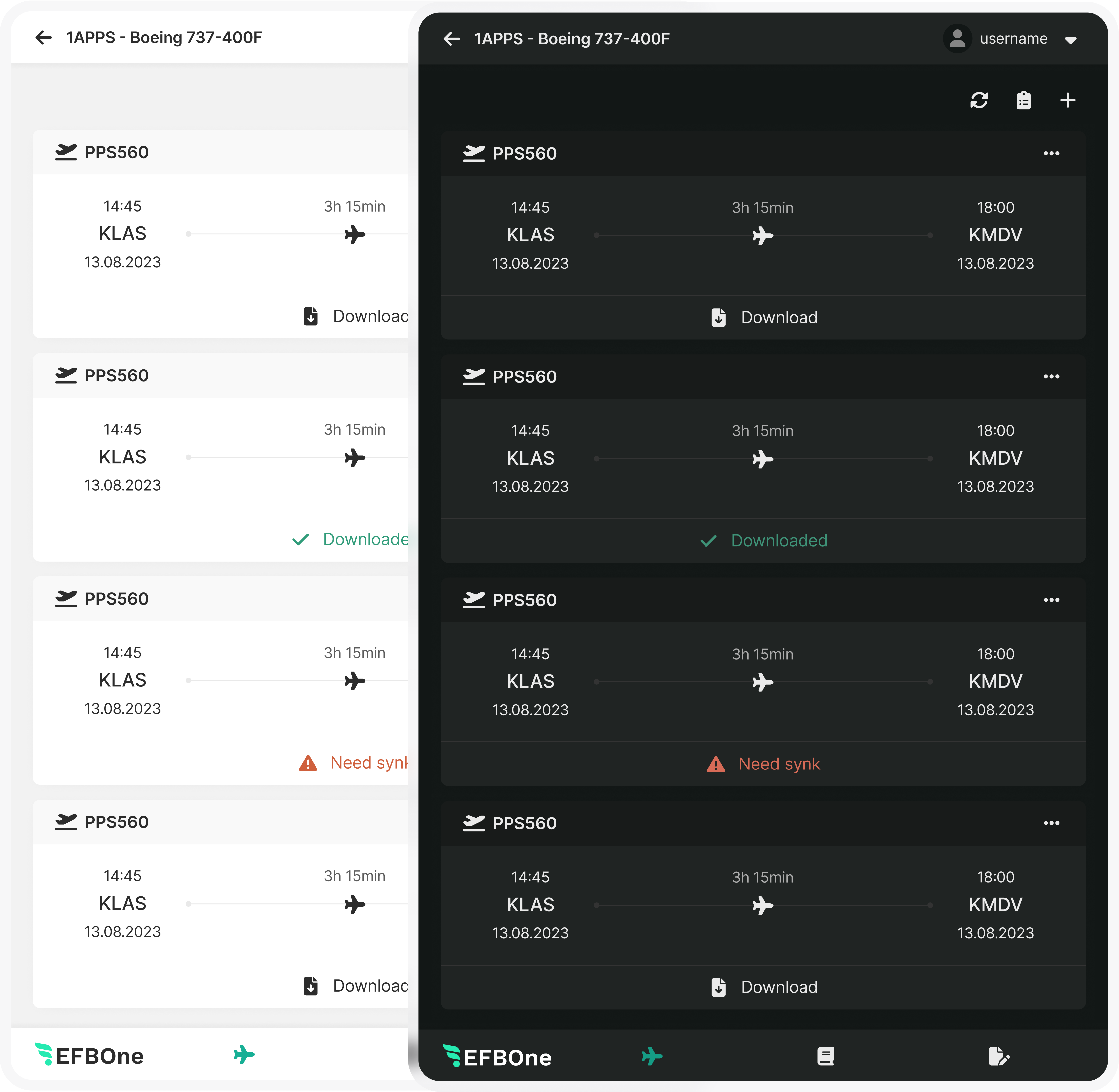
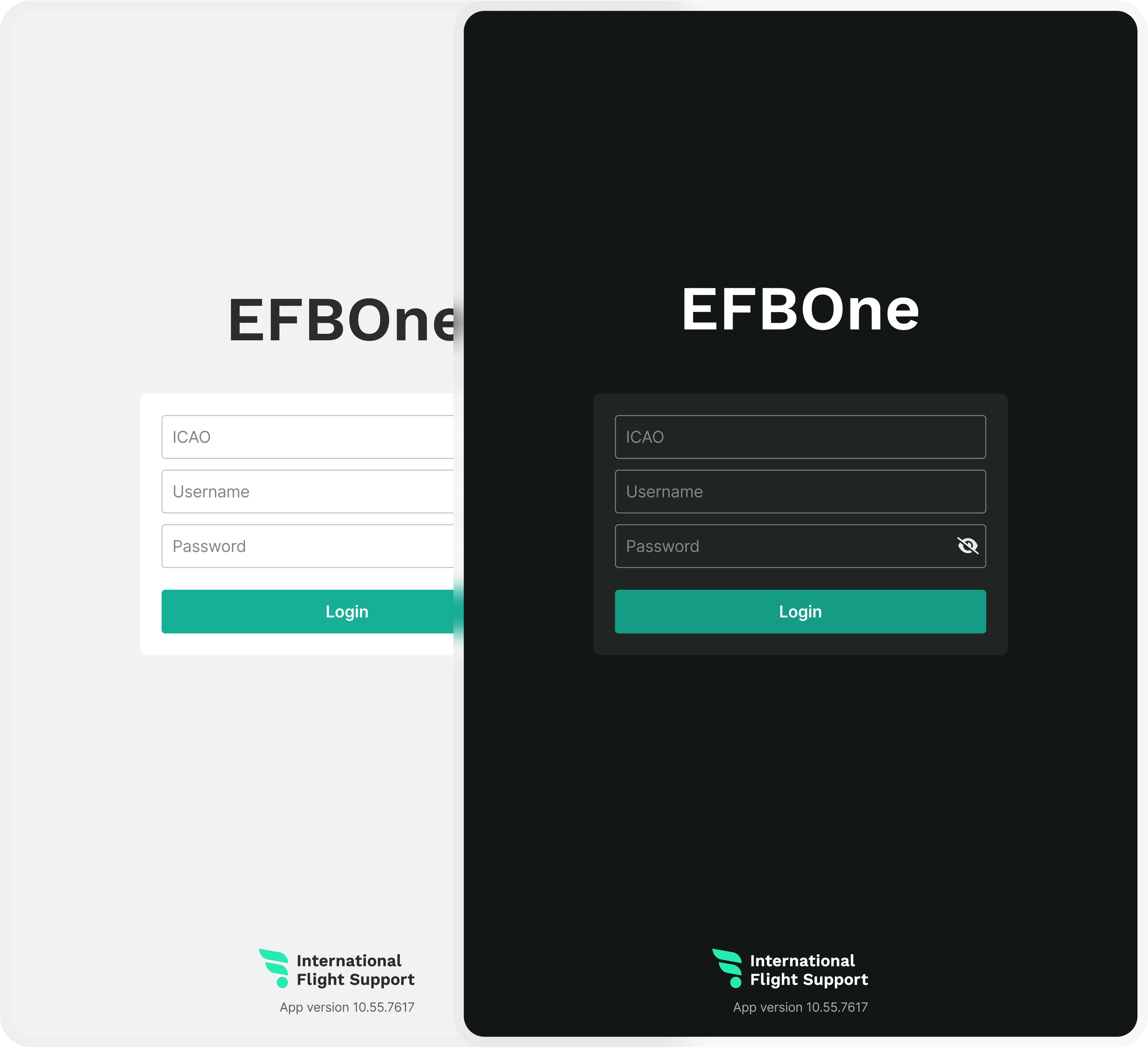
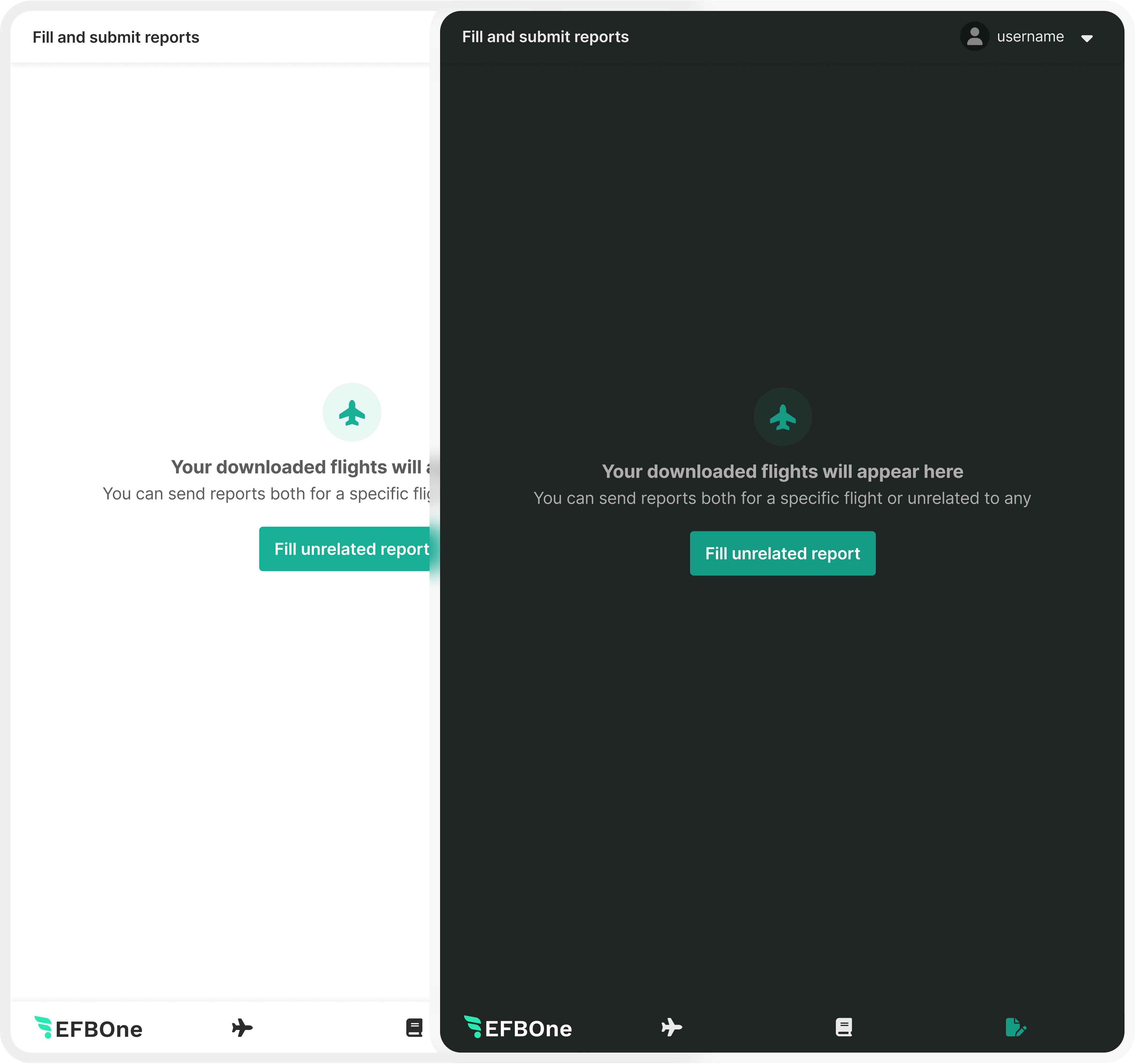
The app effortlessly switches between light and dark themes, ensuring a harmonious visual experience. Each color carefully chosen for the light theme has a matching counterpart in the dark theme. This thoughtful design accommodates the common preference for dark themes in the dimly lit cabin environment, prioritizing both user comfort and usability.


Vital frames have been meticulously rendered in Figma, ensuring easy access and fostering collaboration within the team. This practice allows any team member to quickly locate specific screens, benchmark design decisions, and engage in fruitful discussions.